Data Visualization 101: How to Visualize the Most Common Simple Data Points
From visualizing percentages to visualizing a list, this guide gives you some easy ways to visualize five of the most common types of data.
Which of these sounds more interesting to read?
1. An article that is mostly text, or,
2. An article with engaging images scattered throughout?


I’m willing to bet you picked the second option!
Although both articles are talking about the same thing, peppering it with small, interesting visuals helps break up the text, and makes the article overall easier to read and more engaging.
Images are powerful.
Visuals dominate people’s attention; in fact, images get 94% more views than text-based information.
Not all images are created equal, however; images that visualize data, breaking it down into a more immediately understandable format, are incredibly powerful.
They can give your readers an insightful takeaway that is easy to tweet or share.
They may even use your visual on their own site and link to you as the source, growing your influence on the web.
However, if you’ve never created visuals to accompany your blog posts before, it might be confusing to get started because it’s not clear what you should visualize, or how you should break it down.
This guide will give you easy ways to visualize five of the most common types of data:
A Few Things to Consider First
If you’ve never thought about accompanying your blog posts with visualizations before, it can be a bit of a head-scratcher figuring out exactly what to visualize.
At the core of a data visualization is data; so, how can you break down the main point of your post into facts and figures that would make for good takeaways?
If your post doesn’t include any data, maybe a data visualization isn’t the best way to add visuals to your post; instead, it might be better served by a nice photograph or by pulling out a quotation.

But data is compelling; maybe this is a sign that you should be finding more statistics or other data to back up your arguments.
Before you begin creating visuals to accompany your posts, consider if there are some features you would like to be consistent between all the visuals on your blog, like a color scheme, use of certain fonts, etc.
Always be sure to include your logo on the visual; if someone uses it on their own website, you want their readers to be able to track down the original source, even if the webmaster doesn’t link back.
How to Visualize a Single Number
Sometimes, the most compelling piece of data at your disposal is a single number. Maybe it’s a number so big it’s hard to wrap your head around; or maybe the surprise comes from the understated smallness of the number.
Two simple ways to visualize a single number are with text or with a pictogram chart.
Text
Sometimes the best way to show something is also the simplest. A number is exact, easily understood, and can command attention all on its own.
For example, in the motion graphic The Economy of Coca-Cola, a glass is shown filling with liquid, overlaid with “1.7 billion,” the number of servings of Coca-Cola consumed daily.

Pros: A number is powerful and precise. It can also take up a lot less room than, say, a pictogram chart (shown below).
Cons: On its own there is nothing wrong with using a number, but use too many of them and you run the risk of making your visuals too text-heavy.
Pictogram Chart
A pictogram chart visualizes data using icons that represent that data. Each icon could be worth one item, or a key might explain that each icon represents another value, such as 1,000.
In this infographic, a pictogram chart is used to great effect to show the enormous discrepancy between sharks killed by humans and humans killed by sharks (be prepared for lots of scrolling):

The exact number is not important here, just the discrepancy; however, at the bottom of the infographic, a red box explains that that’s over 11,000 sharks killed every hour.
Pros: Icons can simplify the meaning of complex data, and also make it more understandable across language and cultural barriers.
Cons: Using icons instead of a number is less precise, especially for very large numbers, which are hard to count. Avoid using partial icons to make the data more precise, as it can be hard to understand what a portion of an icon represents.
How to Visualize a Percentage
There are many ways to visualize percentages; as a part of a whole they can be shown in a number of different formats.
One of the most common and recognizable ways to visualize a percentage is a pie chart, of which donut charts are a variation.
Stacked bar graphs are another way to show percentages.
Pie Chart
Pie charts are some of the most recognizable, and some would say, most-overused types of visualization.
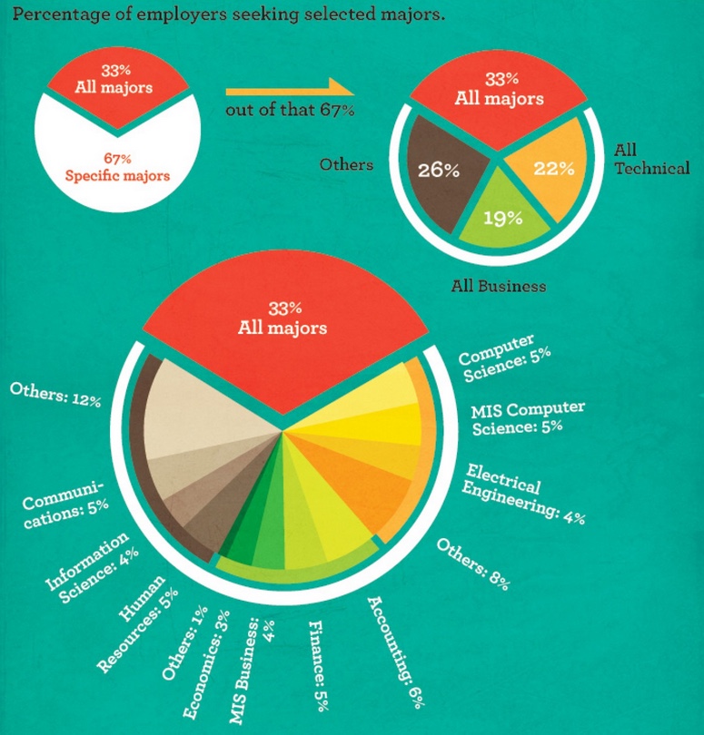
This example breaks a pie chart down progressively more and more:
Pros: Pie charts are recognizable and pretty universally understood. One of the most effective ways to use them is to show one “slice” and how it relates to the whole.
Cons: The more slices you have, the harder a pie chart is to understand. They take up more space than some alternatives. They can be difficult to understand precisely without labels. Difficult to compare trends between multiple pie charts.
Donut Chart
Donut charts are the same as a pie chart, they are just missing the center.
This eases some of the cons of pie charts; for example, they can be easier to understand because removing the center makes different segments easier to compare.
There is also more room in the middle to label the chart.
These donut charts are used alongside a proportional area chart showing the perceived corruption in every country in the world.
The donut charts help explain the percentage of the world that is perceived as more vs. less corrupt.

Pros: Relies less on area and more on the size of the arc, making them easier to understand at a glance. Offer space to add labels on the inside.
Cons: Still difficult to understand with lots of slices, or to understand trends between multiple donut charts.
Stacked Bar Graph
A 100% stacked bar graph shows percentages of a whole within a single bar or a set of bars.
These are particularly useful if you need to show a comparison between multiple datasets.
Unlike pie charts and donut charts, where the circular form makes it hard to compare percentages, the stacked bar graph makes this easier.
This interactive visual compares creative routines of famous writers, artists, and musicians. All the creatives had the same number of hours in a day, but this chart shows how differently they used them.

Pros: Easier to compare between datasets than pie charts.
Cons: The 100% scale may not be as obvious in a bar as it is in a pie chart. Harder to compare segments the more segments there are.
How to Visualize a Proportion
Proportions can usually be visualized similarly to percentages; it’s just another way to think about the data. However, pictogram charts and proportional area charts are especially powerful for proportions.
Pictogram Chart
When using a pictogram chart for proportions, color some of the icons a different color to represent a portion of the data.
This pictogram chart compares populations of UK countries.

Pros: Icons can simplify the meaning of complex data, and also make it more understandable across language and cultural barriers.
Cons: Using icons instead of a number is less precise, especially for very large numbers, which are hard to count. Avoid using partial icons to make the data more precise, as it can be hard to understand what a portion of an icon represents.
Proportional Area Chart
Proportional area charts are even simpler than pictogram charts.
They use the area of a shape to represent its size, and then another shape around or within it to compare it to.
The following example from 2011 shows the European debt crisis using proportional area charts. Countries are ordered by the size of their GDP and then overlaid with a red block representing the percentage of the GDP that is government debt.
In some cases, the debt completely swallows the GDP. The countries are all extremely easy to compare, being arranged this way.

Pros: Can compare lots of datasets easily without needing to rely on labels to get the main idea across.
Cons: It is hard to make these charts very precise and easily interpreted without labels.
How to Visualize a List
Sometimes your standout “data” is actually a list of items. Icon lists and bubble clouds are commonly used to visualize lists.
Icon List
An icon list is exactly what it sounds like: a list, with each item accompanied by an icon. While not exactly visualizing the data – it’s still very text-heavy – the icons can help break up the text.
In this humorous example, beards are ranked in terms of their trustworthiness. Every beard in the list is accompanied by a simple icon showing the type of beard.
![]()
Pros: Can compare lots of datasets easily without needing to rely on labels to get the main idea across.
Cons: It is hard to make these charts very precise and easily interpreted without labels.
Bubble Clouds
Bubble cloud charts is great for displaying, grouping and comparing large sets of data. It’s most useful for illustrating the relationship between elements in a data set and the set as a whole.
Take a look at the example below that shows the number of smokers in the European Union. Rather than using a traditional map, the data is visualized by using a bubble to represent each city. The larger the number, the larger the bubble, so that the size of each is proportional to the value for that country.

Pros: Great for displaying, grouping, and comparing large sets of data.
Cons: It can be hard to get text to fit inside smaller bubbles, resulting in some legibility issues.
How to Visualize Location Data
Location data may seem simple: just slap it onto a map, right?
However, not all maps are created equal. Here are two simple ways to use a map to show data: a chloropleth map and a bubble map.
Chloropleth Map
A chloropleth map is a fancy way of saying a shaded map. States or regions are shaded to a color scale, which generally gets darker the higher the magnitude of your measurement, such as population density.
This is a fairly typical example of a chloropleth map.

Pros: This type of map makes it easy to see trends across a country or region.
Cons: Larger regions are emphasized over smaller ones due to their area seeming more prominent.
Bubble Map
Bubble maps are pretty much what they sound like: a map with a bubble over each state or region, with the bubble’s size representing a particular piece of data.
This example uses bubbles to very clearly show which states have the highest rates of babies exposed to drugs in the womb.

Pros: This type of map makes it easy to see trends across a country or region.
Cons: Larger regions are emphasized over smaller ones due to their area seeming more prominent.
Wrapping Up
So there you go, I hope this guide has helped you find some easy ways to visualize some of the most common data types that you’ll come across.
If you need some professional help displaying your data, consider hiring a professional graphic designer who can give you that polished look that your data deserves.