3 Trending Color Palettes for Branding & Web Design in 2016
ADRIENNE WOLTER | 26 MAY 2016
Try as some might to blaze new trails, the truth is that design does not exist in a vacuum. Every choice is influenced in some way by the tastes and the preferences of the time it was created.
Just look at how something as iconic as the Pepsi logo evolved over time:
![]()
Each change was a conscious decision to update to better match the mood of the times. In the 70s, there was an emphasis on bold, simple geometric shapes which is mirrored in the 1973 logo.
In the 90s and early 2000s, design grew more and more skeuomorphic, a trend reflected in the gradients and liquid look of the 2004 logo.
And in its most recent incarnation, the Pepsi logo has shed all of that to return to simplified shapes and a flat design.
In 2016, we still have design tropes, some of which may go on to be remembered as the iconic styles that define design in the 2010s, like flat design.
We also have a few color schemes that will go on to be known as the colors that defined 2016.
This post will guide you through some of the biggest current color trends, and will offer some advice for how to choose your own signature palette.
Trending Color Palettes of 2016
Where do color trends come from? Traditionally, they come from the fashion and the textile world, with Pantone at the helm. Pantone is the company that created the most widely-used color matching system, with standardized numerical IDs to identify specific hues.
A secret group of color decision makers meets two times a year to determine which colors are “in” for the season, choosing a color of the year and a top ten. Other trends have more organic routes, but they are no less impactful.
Pastels
Pantone went a little wild for 2016 and picked not just one color of the year, as is traditional, but two.
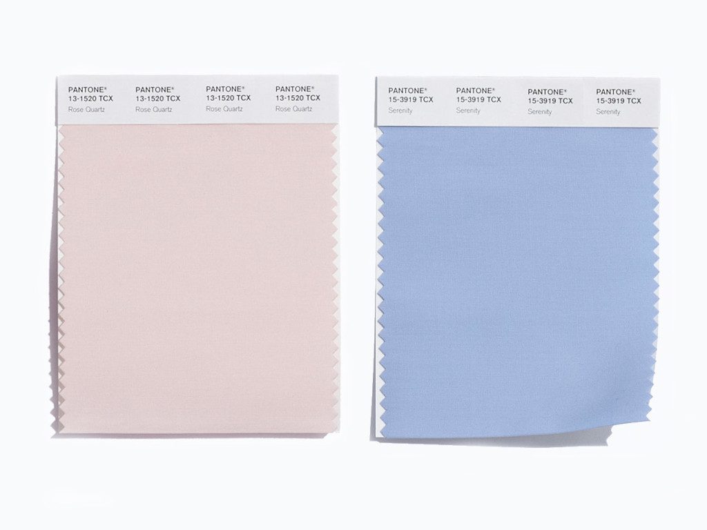
The winners, Rose Quartz and Serenity, are equally-matched pastels evoking a “gender blur” in fashion, according to Pantone. And the top ten colors for spring 2016 feature a number of other pastels to accompany them.
One way we are seeing this trend play out in web design is through the watercolor trend. For 2016, Shutterstock noticed a 234% increase in interest in watercolor stock.
The web is exploding with gorgeous watercolor-inspired designs, and a quick search of a design elements site like Creative Market reveals close to 20,000 results.
With the force of the watercolor trend behind it, pastels are here to stay for the foreseeable future.
Brights
Literally at the other end of the spectrum, bright colors are also taking center stage in 2016.
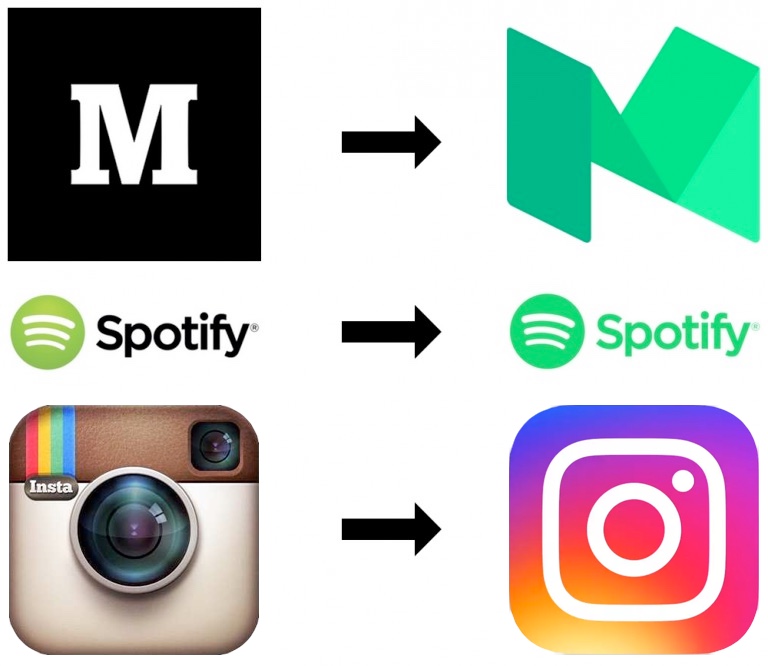
I’ve mentioned before the neonification of logos that has been happening in the past year – the recent trend of brands brightening their logos to new heights on the neon scale – and just last week Instagram followed suit with their new logo.
These brands aren’t just trying to stand out from the pack with their out of this world color palettes; they may actually be onto something. According to Skidmore Studio, a studio that produces whitepapers on millennial trends, these pop culture color schemes connect us to social justice issues like the legalization of same-sex marriage in the United States.
Whatever their reasoning, it is undeniable that tech companies love pops of bright color in their branding, offices, and logos, so the trend is unlikely to go anywhere anytime soon.
Gold and Neutrals
Rounding out our list of trending color schemes is a relative newcomer, but definitely one that is in its heyday.
If you’ve been anywhere near Pinterest, you’ve undoubtedly seen the gold foil trend, as a texture for type and other design elements.
Often, the gold lettering is set against an extremely neutral backdrop of white or black.
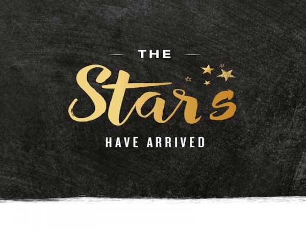
Starbucks chose this color scheme to roll out their newly revamped star rewards program, and the gold does double-duty here. It perfectly suits the motif of stars, and the whole look oozes with a luxury feel that rewards programs often try to evoke.
This trend is popping up across the web on DIY blogs, in Pinterest pins, and a recent wedding I attended even had tiny gold foil hearts letter-pressed into the place cards. It’s glitzy in an elegant way and seems like it will be here for a while.
Choosing Your Color Palette
When you are trying to decide on a “look” for your brand, the style to support your web design and marketing materials, a color scheme is one of the most important factors that you need to decide upon. While today’s trends should inform your decisions – that is, after all, how you look “in touch” with the times – they should not dictate them.
Instead, you need to choose a color scheme that will last. Choosing a color scheme because it is exactly what is popular right now will quickly make your brand feel dated when the trend falls to the next big thing.
Here are a few things to keep in mind as you choose the colors to make up your brand’s color palette:
Color Psychology
Color psychology – the meaning behind the colors you choose to associate with your brand – shouldn’t be the be-all, end-all reason for adding certain hues to your color palette, but you should definitely consider their emotional resonance. For example, green has strong positive connotations that bring to mind environmental friendliness, as well as money. Meanwhile, red imparts a sense of urgency and immediacy, and all that adrenaline can make you hungry.
A brand selling bedding and mattresses, products that promote sleep and restfulness, would be hard-pressed to make a great case for using red heavily in their color scheme. Instead, they would be more likely to choose white, for its minimalism and ability to clear one’s mind, or even pink, which is proven to calm people down.
Your Industry & Competitors
Comparing your color scheme to that of your competitors and other brands in your industry can be insightful for two reasons.
First, it can remind you of the conventions in your industry. If all the brands like yours are building a strong sense of trust around their brand with shades of blue and green, you probably don’t want to be the one sticking out in bright red.
Or maybe you do? Sometimes, it can be a good thing to stand out from the pack, giving you visual distance from your competitors.
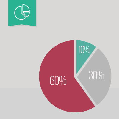
The 60-30-10 Rule
Even the nicest color scheme can look cartoony when applied in the wrong proportion.
You can create a professional color scheme by using the colors you choose in approximately a 60% to 30% to 10% ratio.
The greatest amount of your branding, about 60% of it, should be a neutral color, like white.
Then 30% should be your main pop of color, and 10% a contrasting highlight.
Wrapping Up
There are lots of tools out there to help you create a color scheme. Here are a few of my favorites:
Have another color scheme tool you love using? Share it in the comments below!