11 Examples of Great Landing Page Designs & What Makes Them Work
ADRIENNE WOLTER | 4 FEB 2015
Behind every successful website is a great landing page.
It might be the homepage, or maybe it’s a service page. Maybe it’s an enticing special offer. Maybe there are even many great landing pages all over the site in question.
Technically, any page on a site where people first enter the site could be a landing page, but your business probably has a few primary “gateways” that people tend to start at before moving around the rest of your site.
Is that landing page as effective as it could be at introducing your business or your core product offering?
Are you capturing your desired audience’s imagination? And, in turn, are you capturing all the leads you could be?
Landing page design is part art and part science. You can use A/B testing to make measurable improvements, but you first need the vision and creativity to make the changes that allow you to test.
These 11 landing pages are all different and they all meet the demands of their audience in different ways.
Some urge visitors to sign up for a service; some urge them to download an app; others are simply capturing subscription information.
Whatever the goal, the landing pages below are all great sources of inspiration for your own landing page designs.
1. Flickr
If you are looking for an inspirational landing page, look no further than Flickr. Flickr, a service owned by Yahoo for sharing and storing your photos, draws from their best asset to create a beautiful homepage – their vast library of users’ photography!
Flickr, a service owned by Yahoo for sharing and storing your photos, draws from their best asset to create a beautiful homepage – their vast library of users’ photography!
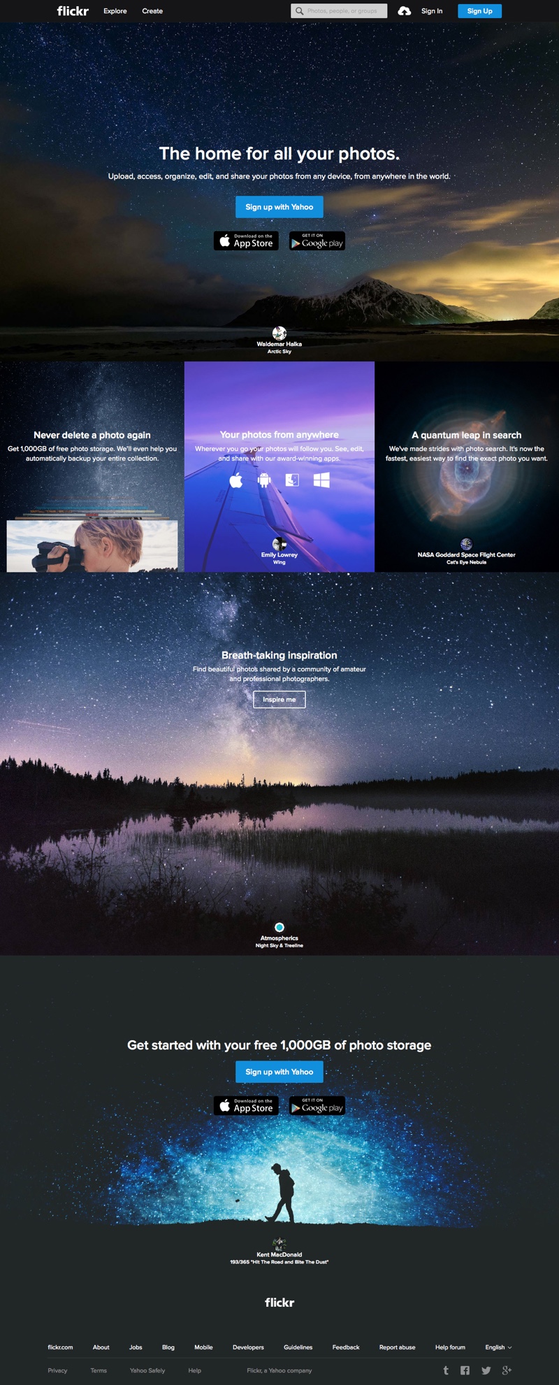
Every time you refresh the homepage, several of the images change, rotating through a collection of stunning and inspirational shots.
They’re not just eye-candy, either; they unconsciously tell the visitor, “this could be you.”
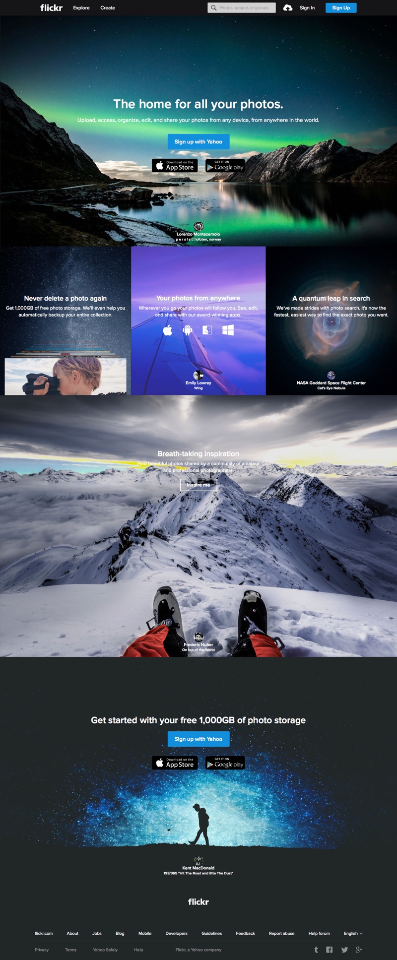
Flickr’s homepage is often imitated – just look at rival service Tookapic’s homepage to see one especially uncanny example – but still packs a punch with its powerful photographs.
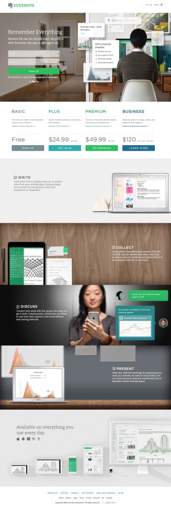
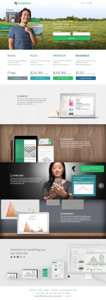
2. Evernote
Evernote is split-testing several variations of their homepage – I could tell just from the “?var=2” at the end of the URL the first time I visited.
By changing the number, I was able to see a few of the variations:
-
- Evernote’s split testing: Version 1
-
- And here’s version 2
Evernote is so many things to so many different people – a to-do list, a shopping list, bookmarks, a notebook, a scrapbook, and more.
It is hard to create a landing page that can appeal to all those audiences, but they succeeded with this friendly and simple design.
3. H.Bloom
H.Bloom offers a floral arrangement subscription service. On their “residential subscriptions” landing page, they do a few key things: introduce the service, explain how it works, and gather consultation requests.
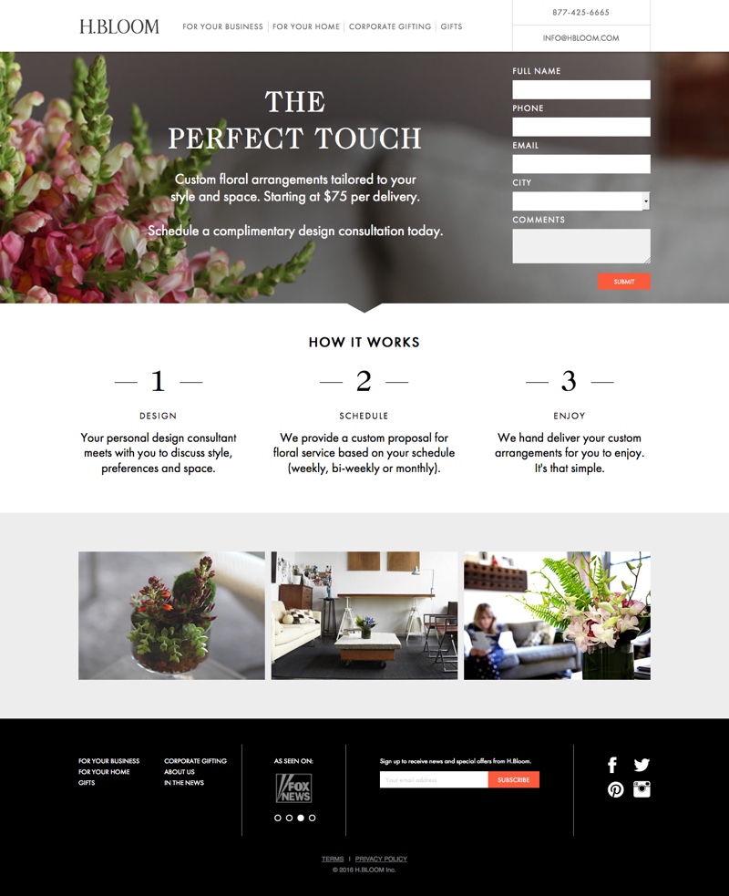
The elegant black, white, and grey design allows the photos of floral arrangements to shine through, and the close-up hero image keeps their consultation form front and center.
4. Night Notes
Night Notes is a simple note recording app with a dark color scheme that won’t burn your eyes when you wake up from a dream and want to write it down, or capture an idea before you doze off.
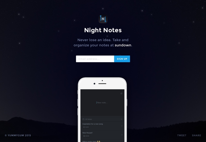
Their one-page website follows the same deep color scheme with white accents that really pop off the dark navy background.
The page requires no scrolling and focuses entirely on an email capture form. As a nice touch, the time of day in the CTA constantly highlights and re-types a different time of day.
5. Facebook Canvas
Canvas is a visual storytelling and advertising platform for Facebook, designed entirely around the mobile experience.
Their landing page emphasizes this fact, with a full-screen background video showing Canvas in action, and three different shots of mobile layouts.
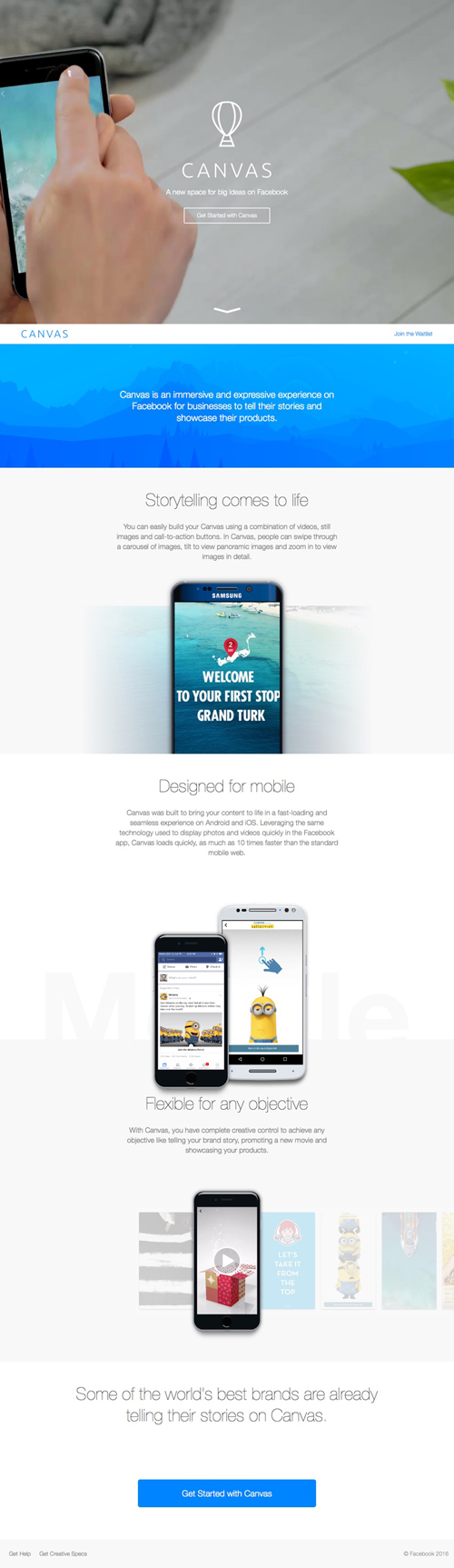
The design is open, with a lot of breathing room, and has hints of Facebook in the colors and font choice without feeling overly-branded.
6. Wellcoin
Wellcoin uses a bright and cheery yellow to introduce their service – which rewards your healthy behaviors with free stuff from health-minded companies.
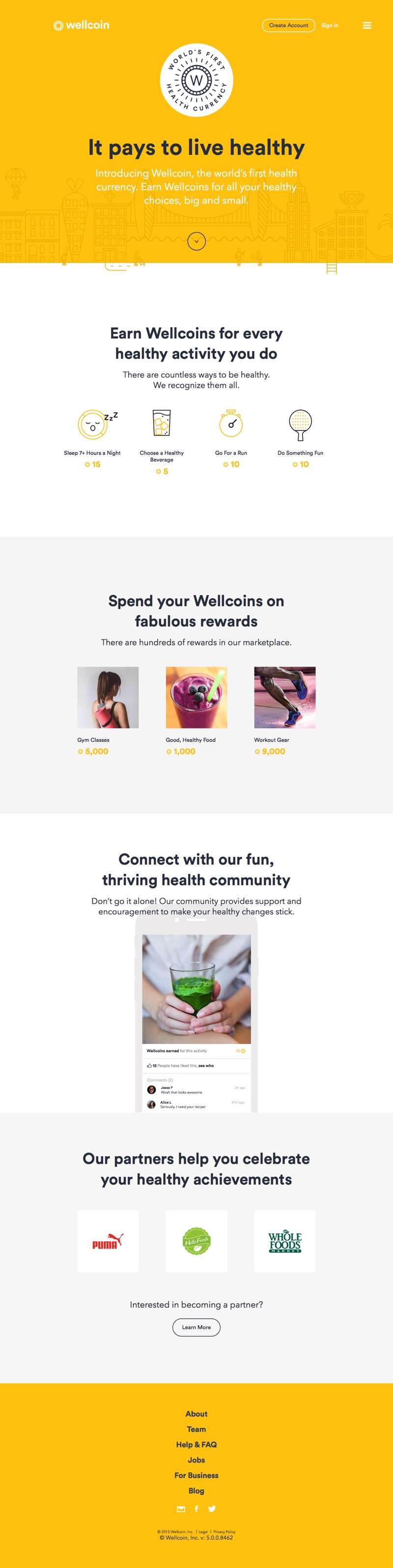
Despite having only a very minimal amount of text, this homepage very clearly gets across the point of their service – and it even has a secondary CTA for potential partner companies.
7. Moto 360
Motorola’s landing page for their smartwatch competitor to the Apple Watch, the Moto 360, is elegant, colorful, and stylish.
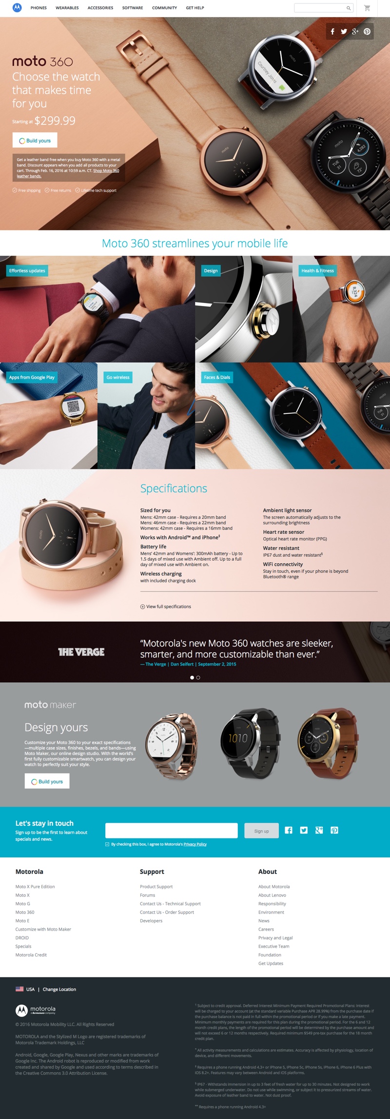
The many close-up product shots on the page celebrate the watch’s fine craftsmanship and details, and rollover animations give the page a touch of interactivity. Near the bottom of the page, they offer the “Moto Maker,” an interactive customization tool for creating exactly the product you are looking for.
The page is effective at introducing the smartwatch and sending visitors off to either make their own, or learn more about specific features.
8. Narrative Clip
The Narrative Clip is a tiny, wearable camera that lets anyone capture “slice of life” videos as they live their life.
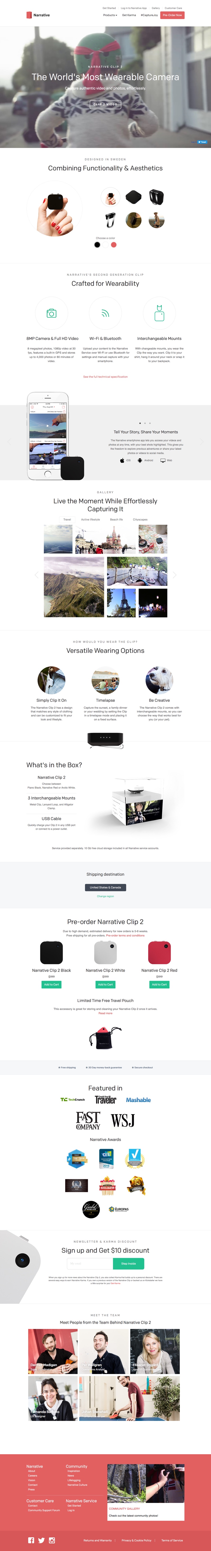
Their homepage, like the landing page for the Moto 360, offers up visitors an introduction to the product and its features as well as purchase options.
Unlike the previous example, this product landing page features a background video at the top of the page, with looping footage showing the camera in use.
This page also emphasizes the experience of owning a Narrative clip, with a masonry grid of images taken with the camera (and filters to see other kinds of shots, like beach scenes and cityscapes).
In one page, you’ve learned everything you need to know about why this camera, seen all the options and accessories, and know why it’s such a nice tool for travelers.
9. Tethr
Tethr is a free set of Photoshop and Sketch UI kits. Their landing page introduces the kit with a clever background video that slides through user interfaces, popping up a template and replacing it with a prototype. It’s a great theoretical introduction to just how useful the kit could be.
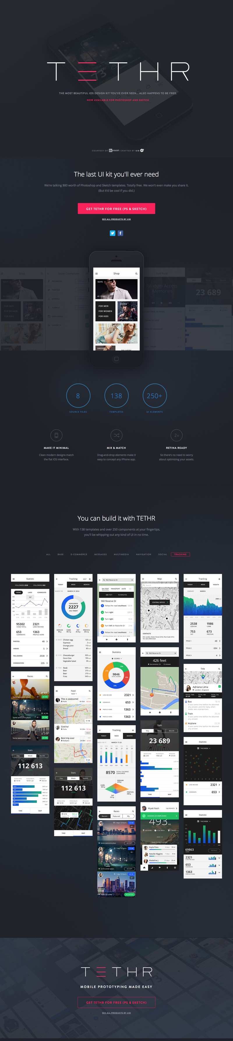
After a little more introductory text, the meat of the landing page is a vast number of sample screens using components from the UI kit.
By default, all are visible, but a designer can easily flip through different categories of components, such as eCommerce, multimedia, navigation, and social, to quickly see if the kit contains something they could use for their app. This powerful preview functionality likely leads to a lot of downloads.
10. Intercom
Intercom is a live chat, feedback, and support tool that helps businesses communicate with customers. Their homepage is an introduction to their product and its features, and has an extremely effective introductory image that compares “the old way” of communicating with customers to “the new way” (their product, of course).
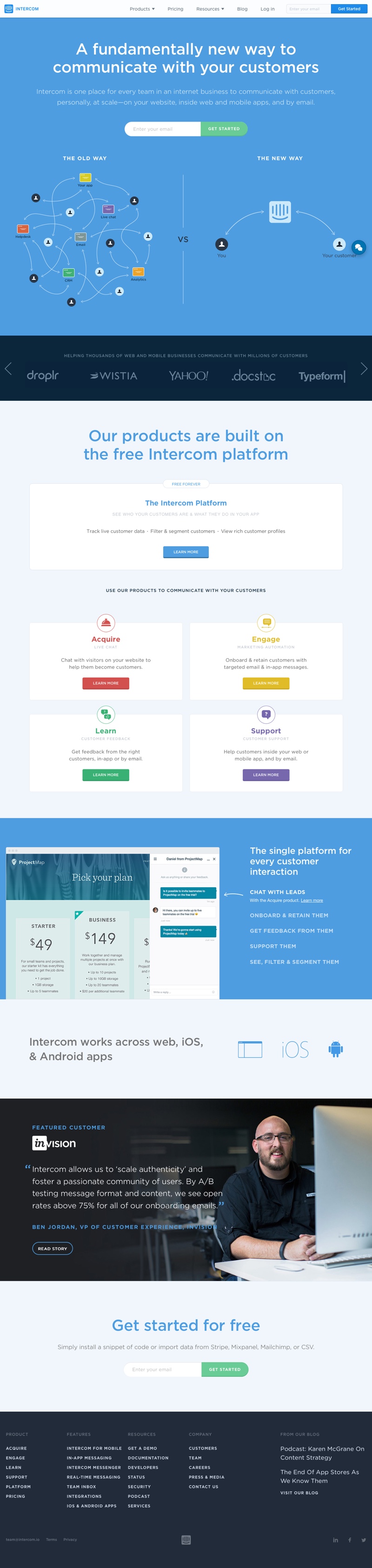
At the very top and the very bottom of the landing page, Intercom is collecting leads via email address. The one thing I would change in their design is making the form for the email address at the bottom pop a little bit more – it is hard, on my screen at least, to differentiate the form from the pale blue background color behind it.
11. Lix Pen
Lix is a tiny 3D printing pen that was funded on Kickstarter. Their landing page is collecting preorders for their product.
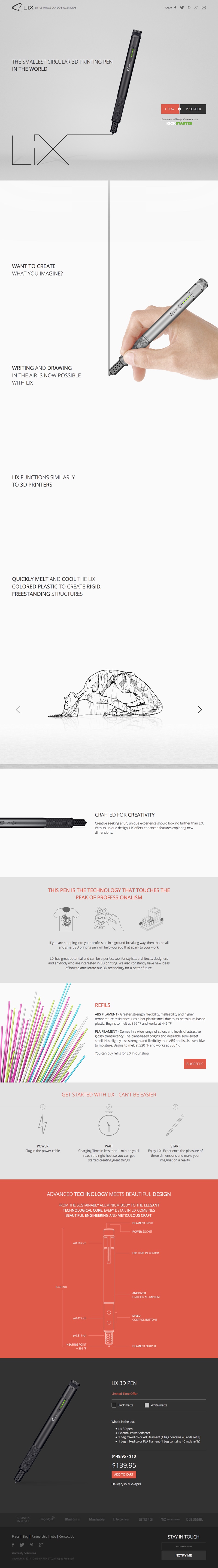
One of the most immediately striking features of the landing page is the hand holding the pen that draws a line down the center of the page, following you as you scroll.
A little gimmicky, perhaps, but it makes it really obvious what the product is and can do!
Wrapping Up
Hopefully this list has given you lots of ideas for your own landing pages! If you are creating or redoing a landing page for your business, here are some of the most important things to keep in mind:
If you are creating or redoing a landing page for your business, here are some of the most important things to keep in mind:
- Introduce your visitors to your product or service. If they are arriving at your landing page for the first time, they likely do not know who you are! Make that introduction exciting, engaging, and inspirational, like Flickr and The Narrative Clip do.
- Show the product in action. With few exceptions, the most successful landing pages feature lots of high-quality, original photography showing their product being used, in different environments, and close up. The same idea applies for digital products – show a representation of what your product can do, like Intercom opens with, and lots of preview screens like Tethr.
- Collect leads at the top and the bottom. Whether you are trying to earn signups, downloads, purchases, or subscribers, give your visitors a place to get started right at the top of the page and at the end. That way, you’ll catch both the audience that has already decided they want to use your service, and the people who want to get to know you a little first.
- Use A/B tests to determine what landing page features and configuration most appeals to your users. This is the science of landing page design – use it to keep improving!