Get More Email List Subscribers with Good Design
ADRIENNE WOLTER | 5 NOV 2015

Your content is brilliant, your newsletter is all set up, and now you’re all ready for the email subscriptions to come flooding in. The only problem is… where are they?
In many ways, getting email signups is a numbers game.
Yes, you need content worth signing up for. But the more people who come through, the more signups you should get.
However, people have been trained to ignore things like ads, or anything that even looks sort of like an ad, like a subscription box. This is a phenomenon called “banner blindness.” This is why you have to do what it takes to make your signup box cut through the noise.
As a numbers game, it stands to reason that the more people who actually notice your email signup box, the more people will sign up.
Here’s how to make your signup box more of an eye magnet, without sacrificing nice design.
Location, Location, Location
The average adult is exposed to over 360 advertisements per day. And that’s just intentional advertising alone; we see overall “brand signals” over 5,000 times a day! With so many ads vying for our attention, we have to tune some of them out. As a result, the typical internet user scans webpages a lot like this:
![]()
Users are looking at the content – that is what they are there for, after all. Anything that even looks remotely like an advertisement is ignored, like those green boxes in the image above.
Despite this, where do a lot of signup boxes appear?
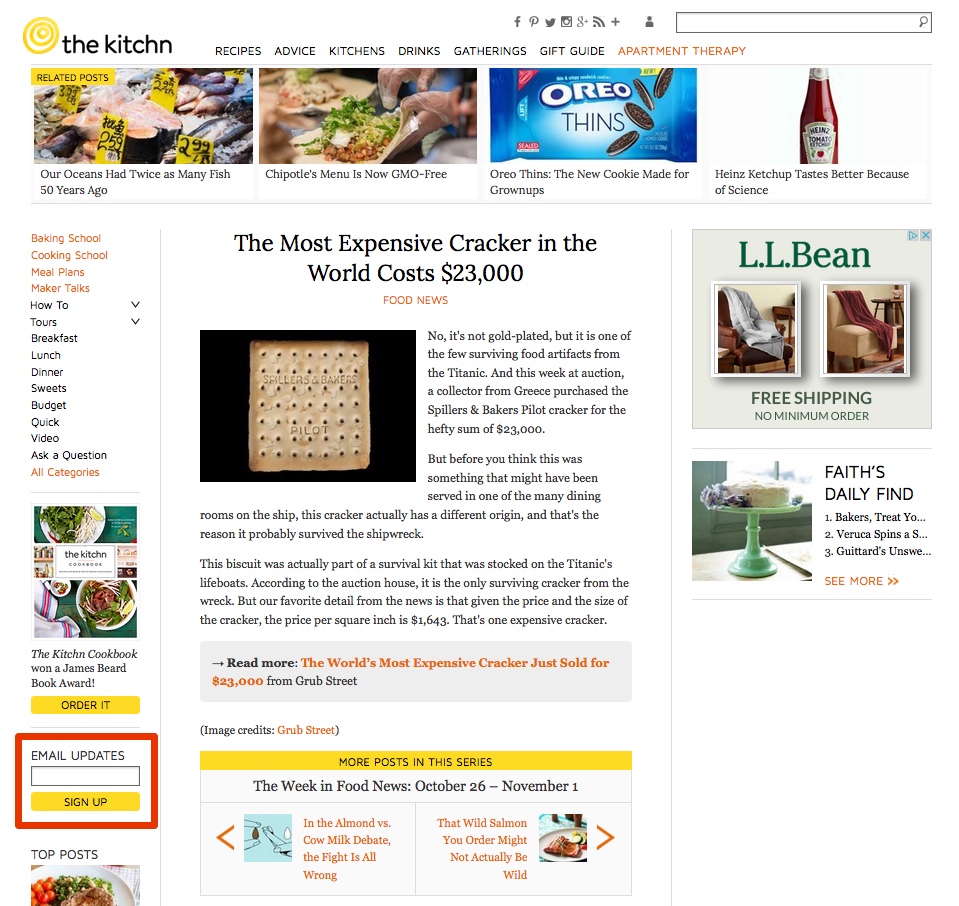
The sidebar. Just like a banner ad.
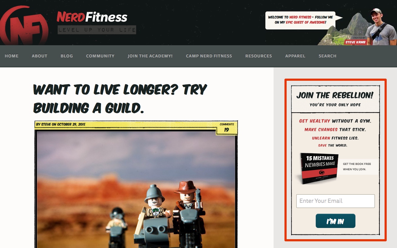
(Side note: as I was writing this article, that NerdFitness example actually changed before my very eyes. Now their newsletter signup is actually much better and featured below. Nice job, NerdFitness!)
If you want people to notice your subscription signup, you should make sure it is not only in the sidebar. It can still be there, of course – if someone actually comes to your site with the sole intention of signing up, you want it to be there for them to find – but you will catch a lot more eyeballs if you also put it somewhere more highly trafficked by the eyeballs that are scanning your content.
Here are four other places to put your signup form that I would argue are leagues ahead of the sidebar in visibility.
1. Hero Area
A hero area is a large visual header at the top of a website. Many modern websites use a hero area to house their call-to-action (CTA). Some sites dedicate that CTA to their subscription box.
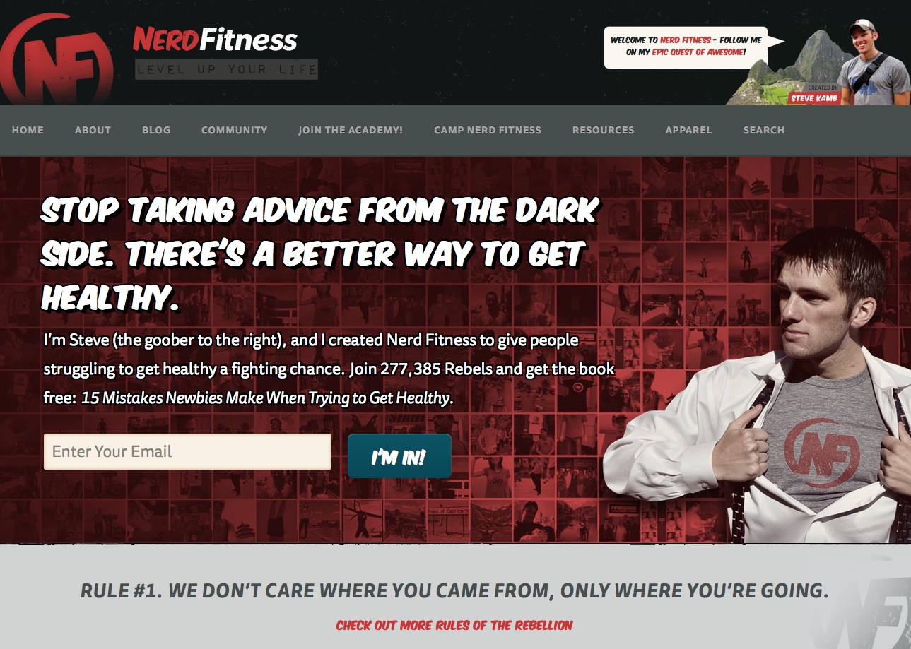
There’s a reason NerdFitness redesigned their subscription signup box – it’s a heck of a lot more effective up here at the top of the homepage than it is sitting there in a sidebar.

Social Triggers has quite the powerful hero area CTA, too – first off, there’s a compelling image of founder Derek Halpern. Aside from being a very recognizable leader in the marketing an entrepreneurship world, he projects the kind of confidence and leadership ability that his subscribers want for themselves. The CTA is contained within an eye-catching shade of blue, emphasizing the word “FREE” with a highlight and drawing the eye to the signup form itself with the asymmetrical shape of the box.
2. After the Article
Part of getting people interested in signing up for your mailing list is getting them invested in your content, and how are you going to do that if they haven’t read anything yet? Instead, capture their interest right after the article, right as they are full of good ideas and thirsty for more.
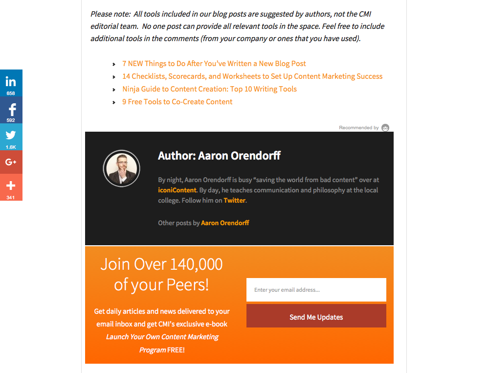
Content Marketing Institute makes a strong case for joining their list after you’ve finished reading an article – this bright orange box directly follows the author bio at the end of the post, calling out to readers with some pretty strong social proof (140,000 subscribers!).
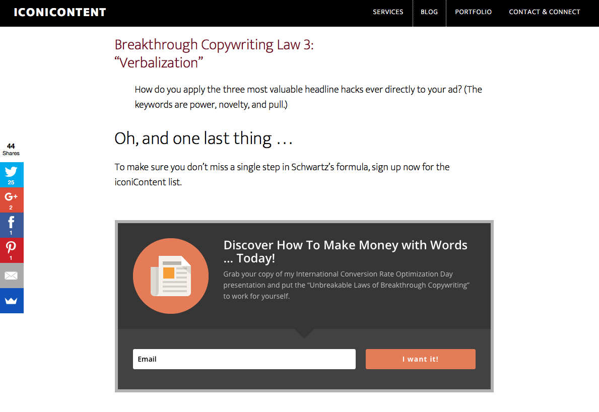
Iconicontent makes a strong call for signing up at the end of their articles, often finishing up with a CTA to sign up… right above the standard signup box that appears at the bottom of every page. Well played.
3. A Dedicated Page
While I definitely don’t think that a dedicated page should be the only form of signup CTA you have on your website, I definitely think there’s a lot of power to this option. First of all, it allows you to make a really strong case for why people should sign up, and a dedicated spot to display testimonials about your newsletter (if you have them).
But the real benefit comes in how it gives you a chance to link to it in context in your articles and even from off your site. If you are writing an article for a major publication in your industry, for example, having a dedicated page gives you a method of capturing that audience and pointing them directly to the signup.
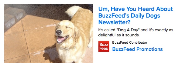
BuzzFeed has a number of different newsletters that slice up their diverse audience, one of which is the Daily Dogs Newsletter. Instead of putting an actual sign up box at the end of posts, they link to a dedicated page about it, where they can win over potential subscribers with adorable photos.
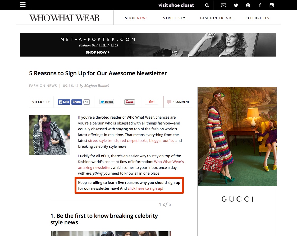
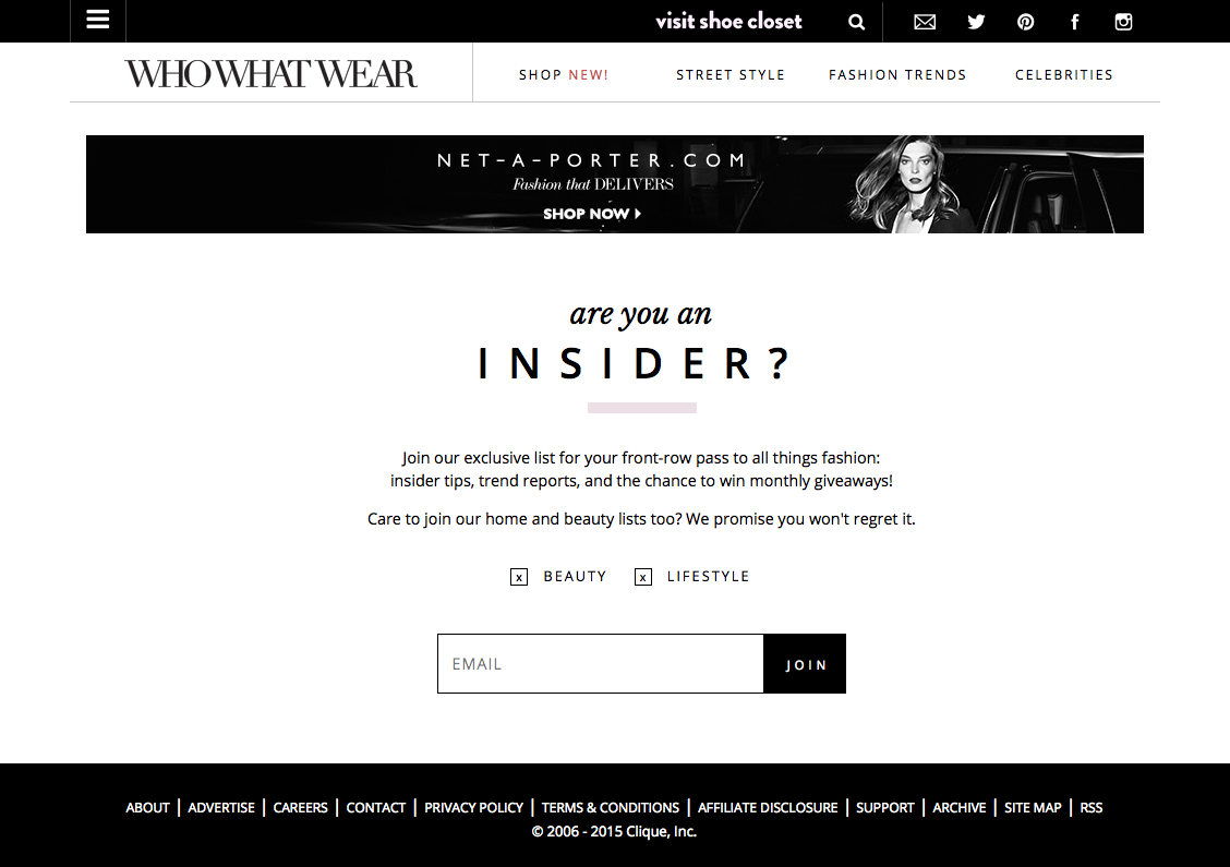
Who What Wear has a dedicated signup page that they occasionally link to from articles like the one above. The signup page, shown below, is simple, sharp, and offers readers the chance to customize the kinds of emails they get.
4. In a Popup
The most disruptive option at your disposal is, of course, the humble popup. If your signup box is in a popup, it will literally jump on top of whatever your visitor is reading and block it from view; they have to engage with it, either to make it go away or to sign up.
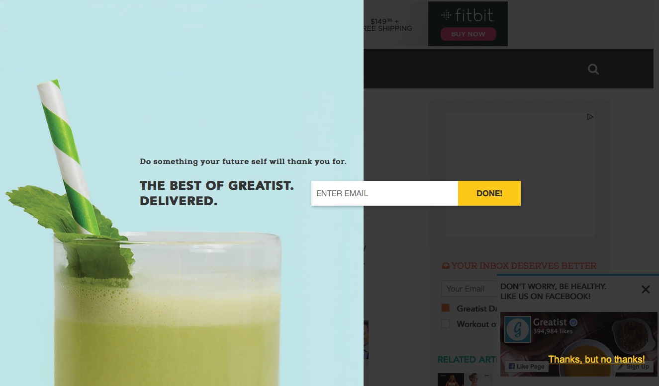
Man oh man, do I like this popup from Greatist. The way it darkens the screen and swings in from the side, the unique silhouette, the way that “Done!” button is sticking out like a shining beacon.
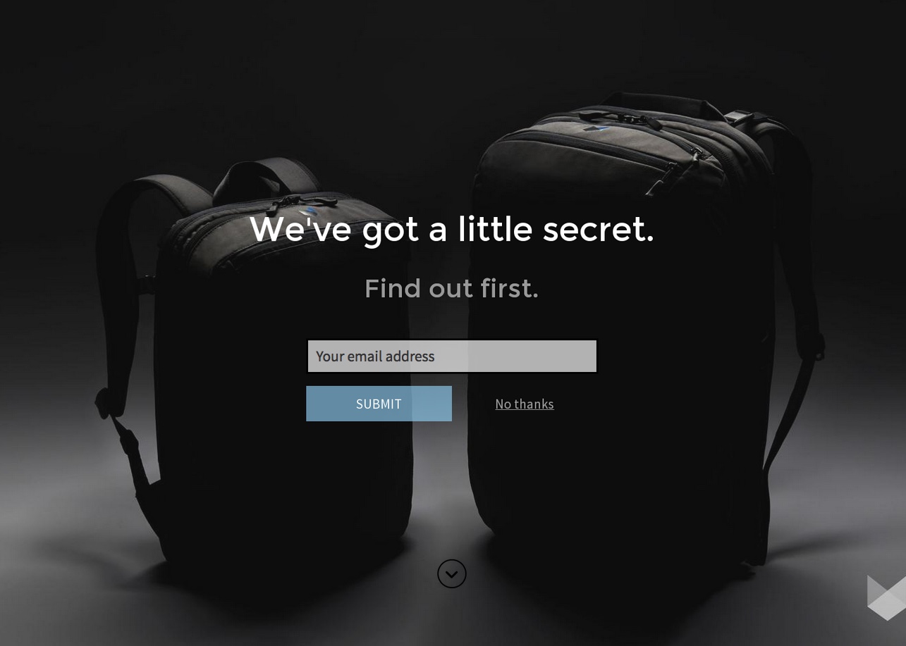
I like this mysterious popup backpack maker Minaal has on their blog. I’ve been seeing a lot of these popups lately, where the screen rolls up to a full-screen CTA. I can appreciate the simplicity, and a Minaal devotee would definitely be enticed by the “secret.”
There are a few different ways to do a popup, and you’ll want to try different ones until you find the one that works best with your audience. Read more about the different options for popups here.
Make It An Eye Magnet
Beyond putting your subscription box in a great location, you can draw eyeballs in other ways.
Color & Contrast
Color and contrast are two of the most powerful principles of design at your disposal. As I’ve said before, colors do have a power to naturally draw certain notions to mind, but it doesn’t necessarily matter as much what color you choose as how much it stands out from whatever is behind it. If you can use a color that brings to mind the emotions you want to evoke in your audience while also popping off the page, even better!
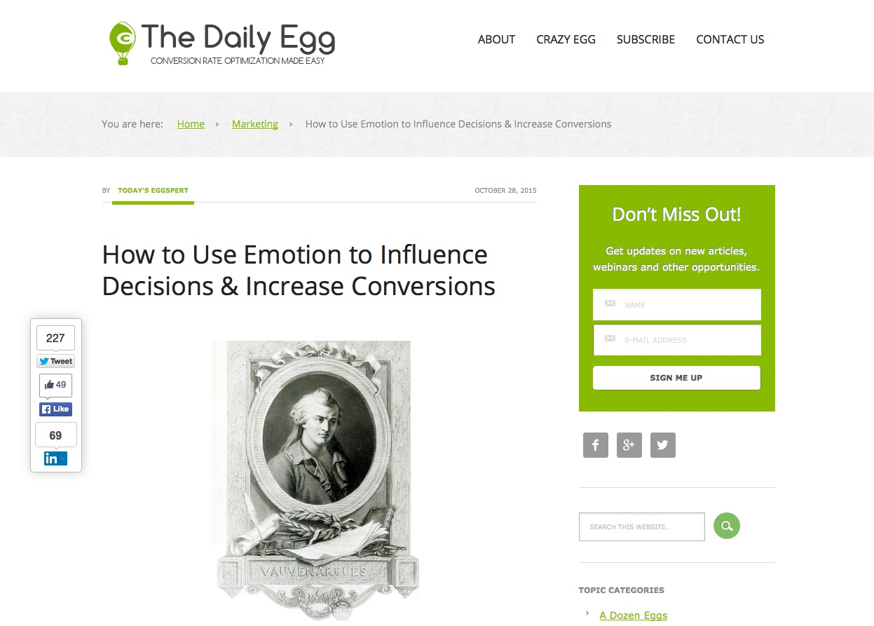
Crazy Egg does a great job making their signup pop off the page, even from their sidebar – it’s the biggest block of a bright color on an overwhelmingly white page.
I really like the colors and contrast on this end-of-article signup CTA by Ahrefs. Orange and blue are two colors heavily used in marketing, sending a message of trustworthiness and fun to balance one another out, and they really jump off the page here.
Visual Cues
As our eyes roam the screen, we are naturally drawn to things that steer our attention – arrows, converging lines, gesticulations, and even lines of sight. Why do you think advertisers see better results when their models look at the product instead of away from it? Use the natural architecture of the rest of your website to draw attention to your subscription box.
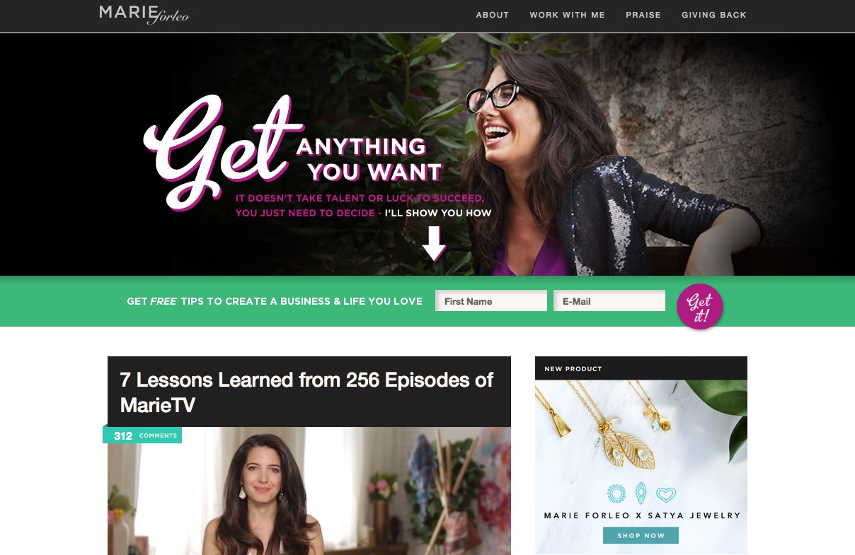
Marie Forleo does this brilliantly on her homepage, with a hero area CTA that points (with an actual arrow!) straight to the email signup. The message is simple: sign up, and she’ll teach you everything you need to know to succeed. The pop of bright green behind it is a great use of color, too.
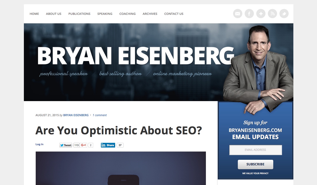
Bryan Eisenberg takes this idea one step forward, and actually points to the signup box in his photo. Brilliant!
Make It Easy
The last way to make your subscription box stand out is to pare it down as much as possible.
Say what?
It’s true. While an extensive form may take up more real estate on the screen, the less fields you include, the easier it will be to sign up. Filling out forms is exhausting. Sometimes I dread filling out contact forms (why do they need my phone number? Are they actually going to call me?). But typing your email address and clicking a button is easy. That’s worth a lot. No wonder so many of the examples above only asked that much.
Buffer’s email signup form, located at the end of every post, is simple, friendly, and best of all, really easy. Just enter your email address and go. They even reassure you that unsubscribing is easy, if you don’t like it.
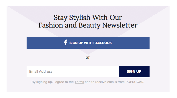
PopSugar makes it even easier (believe it or not), giving readers the option to sign up in a single click, using Facebook.
Wrapping Up
Helping your subscription box stand out will definitely do great things for your signup rate, and these examples are a great place to get started. However, you will always want to test to be absolutely sure before you commit to a major overhaul of your original design. You can either split test the new design by presenting different options to different visitors, and measuring which design performed best, or simply try something new for a few weeks and see if you can detect any major changes. The important thing is to test; you don’t want to stick with a design that isn’t doing you any favors.
There are a lot of brilliant examples of subscription boxes to learn from on the internet. Do your part by noting which CTAs catch your eye or even drive you to sign up. Something is working for them, and you might be able to make it work for you, too.